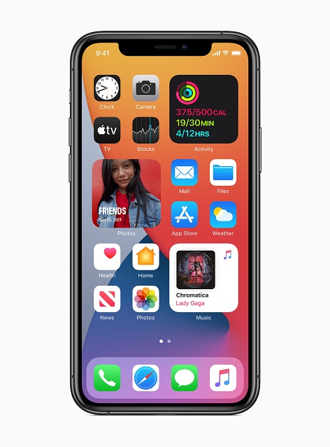
With the new iOS 14, things are getting a lot more complicated not just for the home screen but there’s a lot more to it. There was a time when the Apple home screen did not change come what may. Android was this, Windows phones were doing that but Apple remained unmoved. That is until now. With iOS 14 in tow your home screen is set to get a lot more complicated to say the least. If we had to wait 14 updates for a better home screen, surely the features must be worth mentioning. So let’s do that shall we?
Should you Download the Beta of iOS 14 Now?
I know iOS 14 promises a lot and you just can’t wait to get a hold of it. First of all the beta of iOS 14 is all set to release somewhere in July. So there’s no downloading nothing till then, anyways.
Second of all you might want to leave downloading the beta till later on, that is till you get the final version of iOS 14. The only people who need download the beta now are developers who need to tinker with iOS update to develop their own apps.
If you’re not a developer then betas are best left alone. Not that this one has any major problems or anything. But Betas in general have a lot of jagged edges and bugs that need working out on.
Now on to the dynamically changed Home Screen in iOS 14:
If you had to say something positive about the current home screen you’d probably say that it was simple and trustworthy. Which in a way it is. No matter what app did what all complicated things, you can always go back to the home screen to get your sanity back.
Well if that’s really your kinda thing, then that’s not changing with iOS 14, save an “App Library” off to the side.
If you like the complex, then there’s an option for that with iOS update. This was a good idea in striking a balance. When we talk complexity, Apple has given us four ways of doing it. Introducing these four ways will really change the way you interact with your home screen.
Widgets with Latest iOS Update on the Home Screen:
Coming to widgets, which happen to be one of the more noticeable developments when it’s comes to iOS update. These widgets come in three different sizes, just like what Windows phones do and can be placed with files and folders in a clean grid. Again much like what Windows phones do. So far things are looking good.
It’s not that Widgets weren’t there with iOS but they were only meant to bet in a vertical scrolling section. With iOS 14 they are now placed on the home screen.
Another plus with these widgets are that they are smart. This basically means that your widgets will appear in a stack according to relevancy. Isn’t that cool, in a way?


