
People usually prefer to express data through charts, and it is why you can find them in programs like Google Sheets dealing with big information sets. If you want, you may include charts and graphs in Google Docs. Let us discuss here how to make a chart in Google Docs.
What is a chart?
A chart is a way of graphical representation used for data visualization. Here, the symbols like bars, lines, slices represent the data.
How to Make a Chart in Google Docs:
You need to follow the method to create a chart in Docs. The process applies to a bar, column, line, or pie chart.
- You may tap on the document wherever you are willing the chart. The reason is that you can change it later in case you don’t know sure right now.
- After that, your need to head towards the Insert menu from the top of the page and open it.
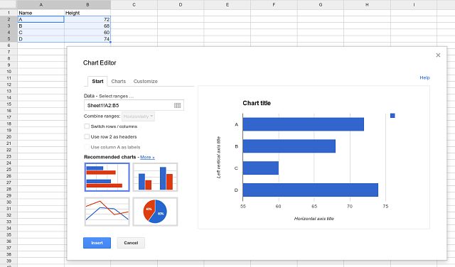
- Select a chart type from the chart submenu to have a pre-configured one. Then, if you are willing, you can choose From Sheets to use a chart you have made.
We have given here some differences.
Bar graphs come with horizontal blocks, whereas column charts are vertical blocks.
It has line graphs showing data points with a straight line connecting them.
Pie charts cut into pieces the information within a circle.
You will find that you can not edit the data in the chart, and the docs don’t allow you to tap on it and make changes, enabling you to import data only. The actual data behind the chart is in Google Sheets, and it is the place where the data is actually available. Therefore, if you are willing to edit anything, you have to go there.
How to Change Chart Type with Chart Editor Tool:
Take the help of the tool if you are willing to change the type of chart. If you don’t find it automatically on the right, tap the chart twice to display the menu.
While you are in the “Setup” tab, you need to select an alternative form of a chart from the “Chart Type” drop-down menu. You will find various graphs and charts grouped all together. In this case, you need to tap on any options to change the type from a line chart to another kind.
Your chart will instantly change as soon as you choose to match the new chart type.
Add Chart and Axis Titles:
- When you create any new chart, it will pull titles from the data range that you have chosen. After completing the chart, it is possible to edit. Besides, you can add different axis titles so that others can understand them easily.
- Tap on the “Customize” tab when you are using the tool. After that, you should tap on the “Chart & Axis Titles” to display the submenu.
Customize Chart Titles:
Google Sheets make a title with the help of column headers from the data range used for the chart. Besides, you will find the “Chart & Axis Titles” submenu as the default to editing the chart title. However, if the option is not set to default, choose it from the drop-down menu.
After that, your job is to edit the title to the selected alternative in the “Title Text” box.
The title changes automatically as soon as you have completed typing. If you are willing, edit the font, size, and text format with the options available under the “Title Text” box.
Add Axis Titles:
- Google Sheets add titles to the individual chart axes. Whether you are willing to include titles for clarity, do this from the “Chart & Axis Titles” submenu.
- After that, you should tap on the drop-down menu. Next, choose the “Horizontal Axis Title” option for adding a title to the bottom axis. Otherwise, select the “Vertical Axis Title” option for adding the title on the left or right side, relying on the chart type. When you are in the “Title Text” box, you should write an ideal title for that axis, and it will appear on the chart automatically as soon as you end typing.
The title allows you to customize the font and formatting options with the help of the provided options instantly under the “Title Text” box.
How to Edit Google Docs Charts:
You can change the data inside the chart or manage the information. Hence, you need to do all the things from Sheets.
- If you’re a beginner at Google sheets, you should choose the chart you are willing to edit.
- After that, you have to select the Open source option to edit the arrow at the top-right.
- Now, you can see the Google Sheets opening, and it is where you need to edit the chart.
If you are willing to add any information or remove it, your job is to edit the information cells. First, you need to choose the chart itself, and then you are required to open its settings to modify things such as the data range, colors, the legend, axis details, etc. In this case, you need to tap two times on the chart title to make it yourself.
- You need to go back to the Docs as soon as you complete editing. After that, your task is to take the help of the UPDATE button on the chart to refresh it with changes you have made.
How to Do Surface Level Editing:
You can perform a few surface-level editing within Docs. For example, the process of moving charts is the same as moving images. Therefore, it is possible to define how to sit with other texts. When you tap on it, you will see three options: in-line, wrap text, and break text. An in-line option is available on the same line as the text, whereas wrap text is available within the text. The break text option is available on the line without text on either side.
If you are willing, you may rotate charts and resize them. After that, your job is to choose the item as soon as you see blue border boxes. Next, you should take a corner box and drag it inward or outward if you want to make the chart smaller or larger. Finally, you will find the circular button at the top, used for rotation.
While tapping on the button, you can see the three-dotted menu button appearing under the chart. It lets you know how to access additional options such as recoloring, transparency, brightness, and contrast toggles.
The Bottom Line:
We have given here details about how to make a chart in Google Docs.You will find creating a chart in Google Docs is much simple. Go through the article properly to find the best.